(1)Don't touch me
! tomato别碰我!番茄!-Design Experiments实验性-Lycopersicum, the species epithet for tomatoes, translates from Latin to mean “Wolf Peach.”I like the contradiction. A vicious sweetness.
Both things, I think, can be true. 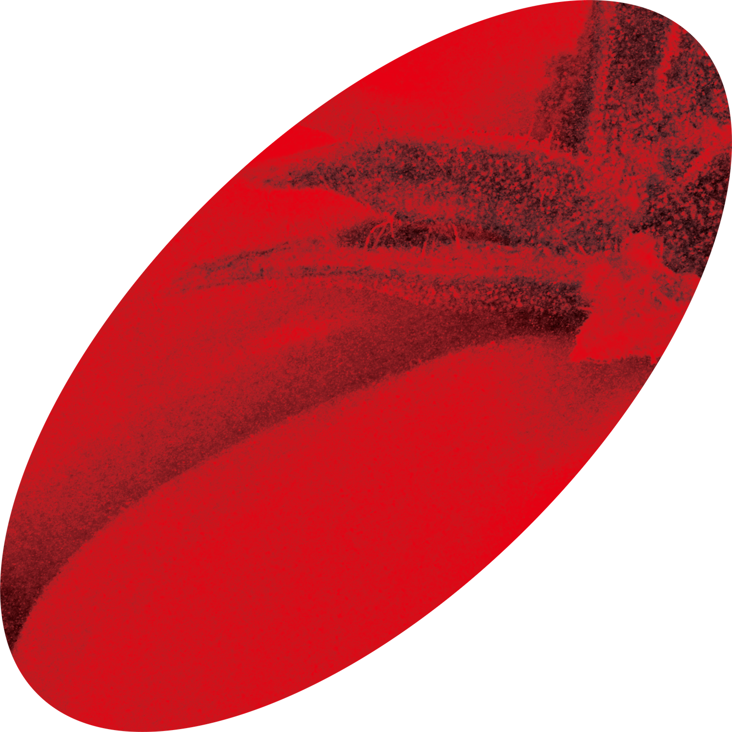
![]()
I hope this will be a mysterious, crimson tale—one so accessible that humanity constantly intervenes, whilst within the story the tomato serves as an ever-changing embryo, making a ‘sacrifices of innocence’.番茄的种加词源自拉丁语,意为“狼桃”。我喜欢这种矛盾:一种危险的甜美。我想,两者都可以是真实的。我希望这会成为一个神秘的、深红色的故事——它如此容易接近,以至于人类不断介入;而在故事中,番茄如同一个持续变化的胚胎,作出“纯真的牺牲”。
I hope this will be a mysterious, crimson tale—one so accessible that humanity constantly intervenes, whilst within the story the tomato serves as an ever-changing embryo, making a ‘sacrifices of innocence’.番茄的种加词源自拉丁语,意为“狼桃”。我喜欢这种矛盾:一种危险的甜美。我想,两者都可以是真实的。我希望这会成为一个神秘的、深红色的故事——它如此容易接近,以至于人类不断介入;而在故事中,番茄如同一个持续变化的胚胎,作出“纯真的牺牲”。
(9)Menmosyne记忆女神图集-Book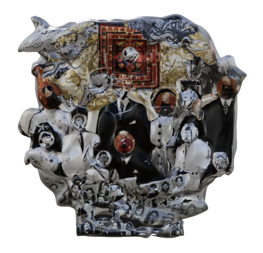
![]() -These images are an amalgam of civilisation and individual memories, with the pictures brought together by different motif texts. Grandiose and mysterious, they seem to show a civilisation with intertwined destinies.这些图像融合了文明与个体记忆,并通过不同主题的文字被组织在一起。它们宏大而神秘,仿佛呈现出一个命运相互交织的文明。
-These images are an amalgam of civilisation and individual memories, with the pictures brought together by different motif texts. Grandiose and mysterious, they seem to show a civilisation with intertwined destinies.这些图像融合了文明与个体记忆,并通过不同主题的文字被组织在一起。它们宏大而神秘,仿佛呈现出一个命运相互交织的文明。
(8)Balance平衡-Design Experiments实验性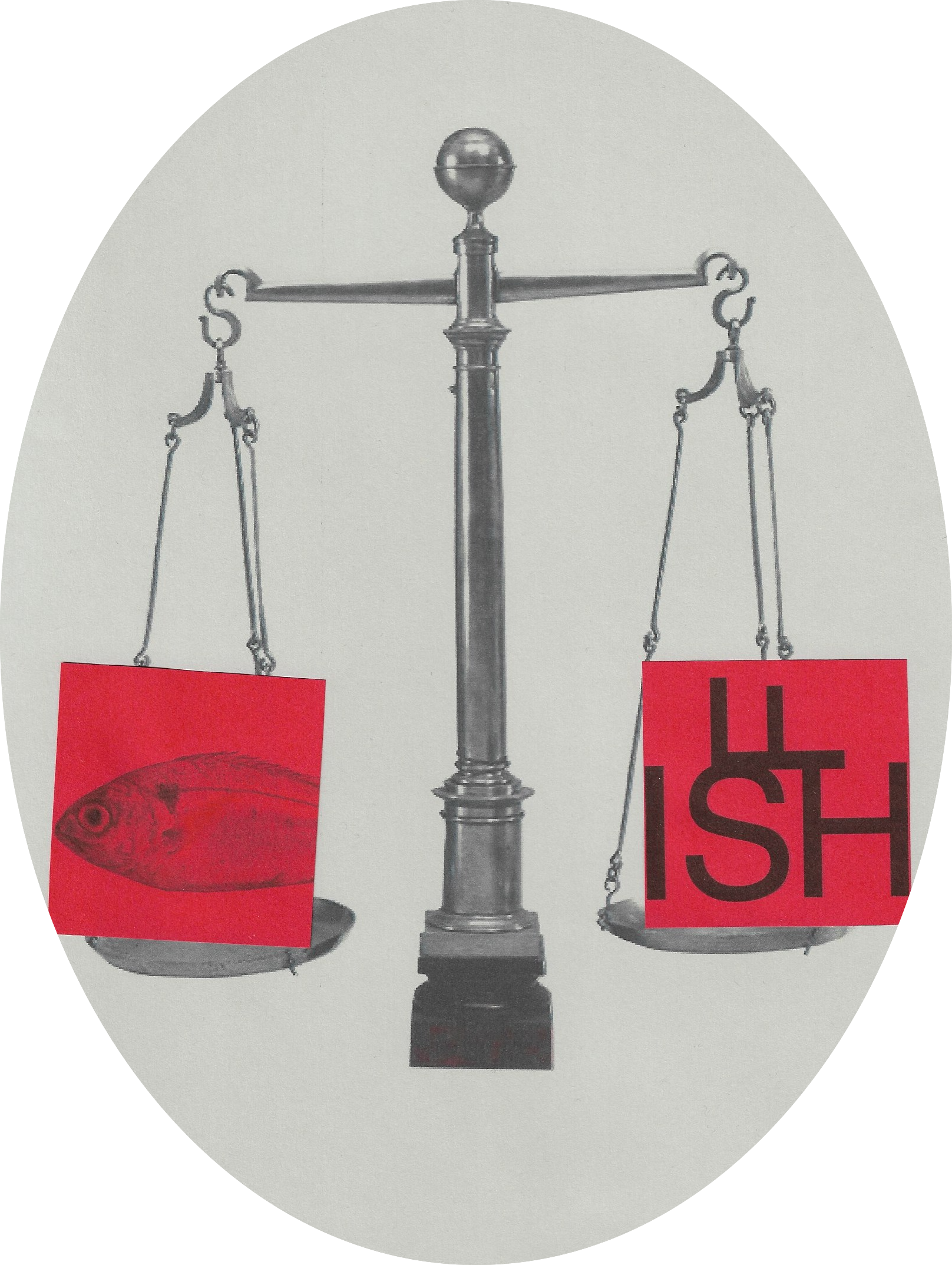
![]() Two-dimensional balance is a state of parity between positive and negative forms, while three-dimensional balance is a state of superposition formed by gravity fulcrum. This visual experiment hopes to show the state of transition and interweaving between the two, so as to return to the "balanced" context itself. The world is constantly becoming more chaotic, more moisture is always there. But we are always looking for balance.二维的平衡是正形与负形之间的对等状态,而三维的平衡则是由重力支点形成的叠加状态。这个视觉实验希望呈现两者之间过渡与交织的状态,从而回到“平衡”这一语境本身。世界不断变得更加混乱,潮湿始终存在,但我们一直在寻找平衡。
Two-dimensional balance is a state of parity between positive and negative forms, while three-dimensional balance is a state of superposition formed by gravity fulcrum. This visual experiment hopes to show the state of transition and interweaving between the two, so as to return to the "balanced" context itself. The world is constantly becoming more chaotic, more moisture is always there. But we are always looking for balance.二维的平衡是正形与负形之间的对等状态,而三维的平衡则是由重力支点形成的叠加状态。这个视觉实验希望呈现两者之间过渡与交织的状态,从而回到“平衡”这一语境本身。世界不断变得更加混乱,潮湿始终存在,但我们一直在寻找平衡。

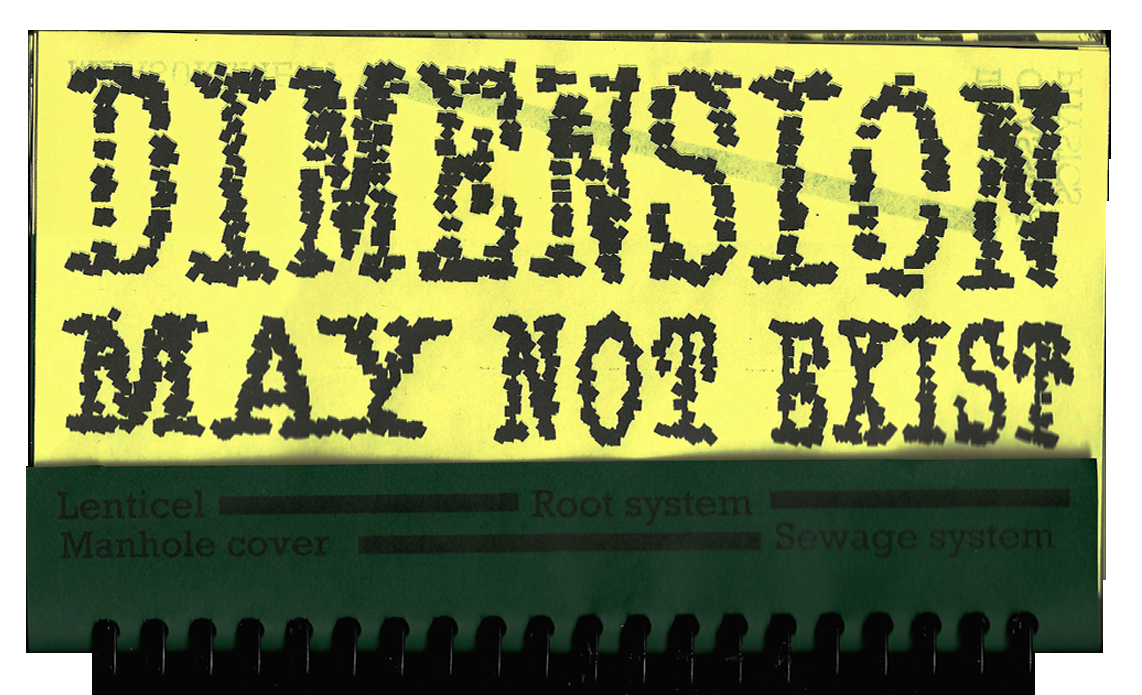
 The typeface features a deliberate break at the 4/1 point of each letterform, resembling a reflection on water—an echo of the brand’s name, “Rainfall.” The logo itself is a playful interpretation of falling rain, adding a touch of visual interest. The overall aesthetic is built on strong, blocky, mosaic-like shapes, hinting at the pixelated nature of digital screens and reinforcing the brand's connection to moving images and digital media.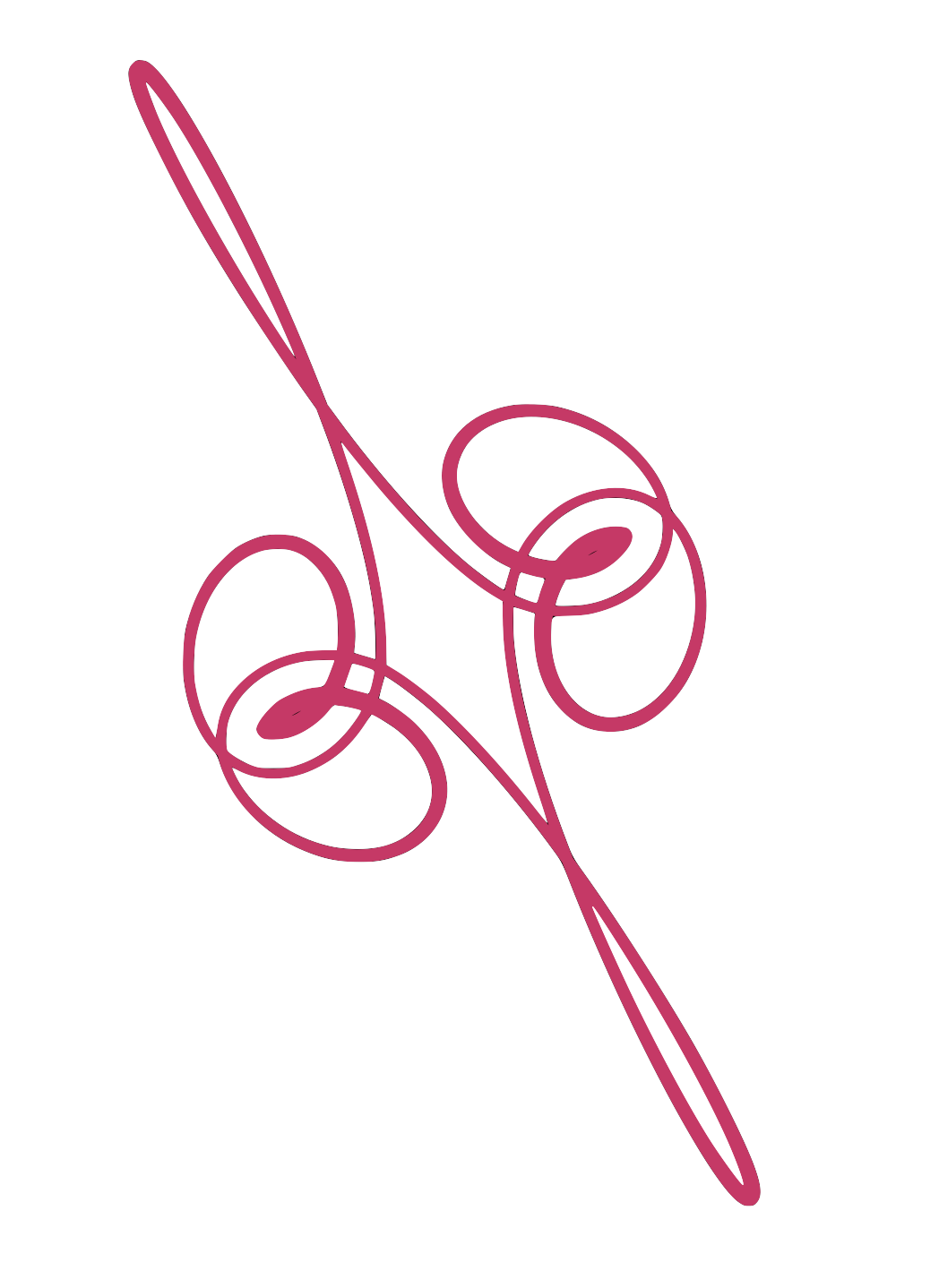
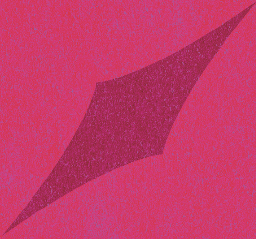
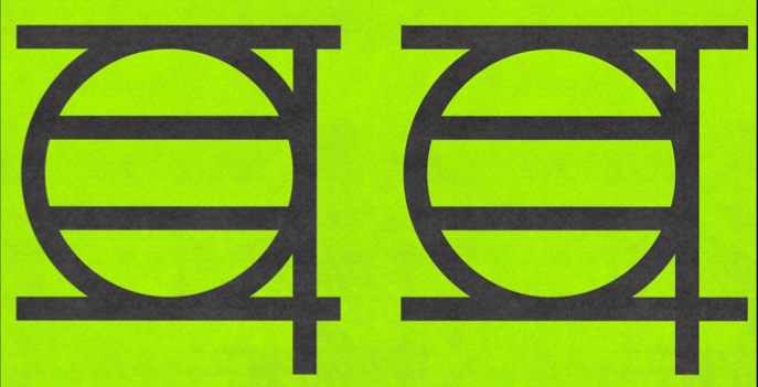
 -This is a poster designed for the BOOOM Art Festival in Shanghai. Unfortunately, this design was not used in the end.